Logos, colors, type, and everything that goes with them, designed so your business looks established, trustworthy, and impossible to mix up with the competition.
Every identity starts from scratch, built around the business, the people it serves, and the places it shows up.
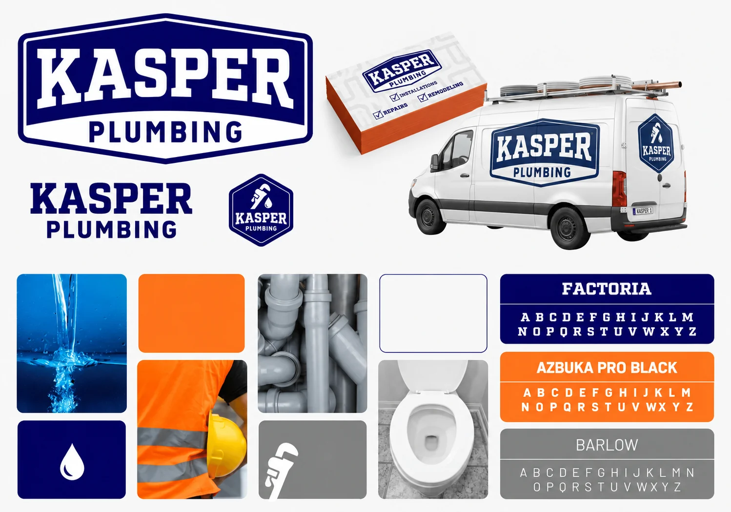
Bold, driven, and serious about the work, just like the plumber behind it.
A young plumber with years in the trade and the reputation to back it up, starting his own company. We built a badge, wordmark, and wrench-and-drop icon that read clearly from a van door or a business card. Deep navy says trustworthy and established, while high-visibility orange comes straight from the jobsite, so the brand feels at home in the trades without looking like everyone else's.
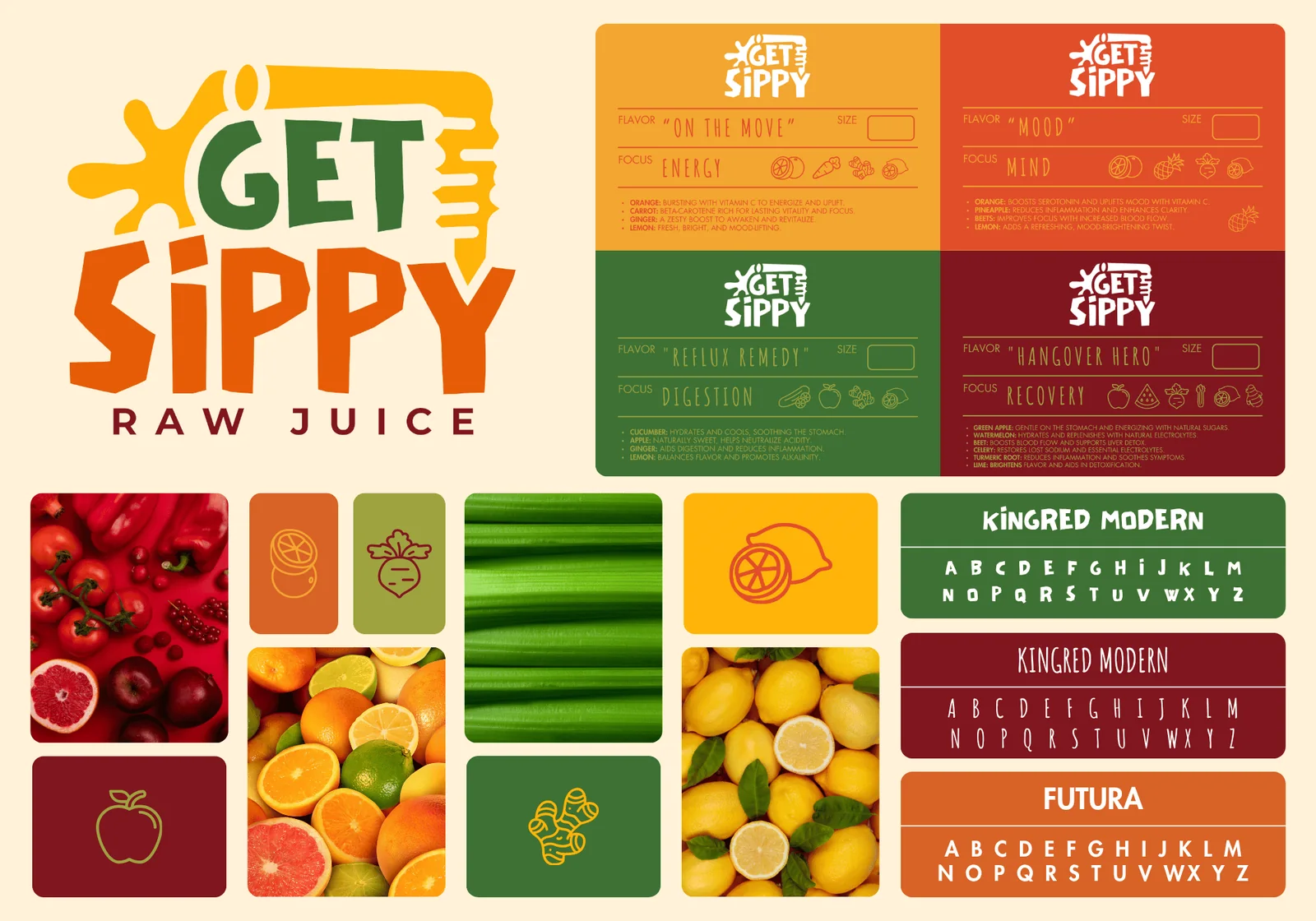
A raw juice brand with streetwear energy, and our favorite one yet.
The founder wanted bold, eclectic, and unapologetically loud, inspired by New York streetwear rather than clean green smoothie aesthetics. We built a hand-styled logo with a juice-splash mark, four labels color-coded to their hero ingredients, and handmade type that still reads at label size. It never made it to the shelf, but it was too good to leave in a folder.
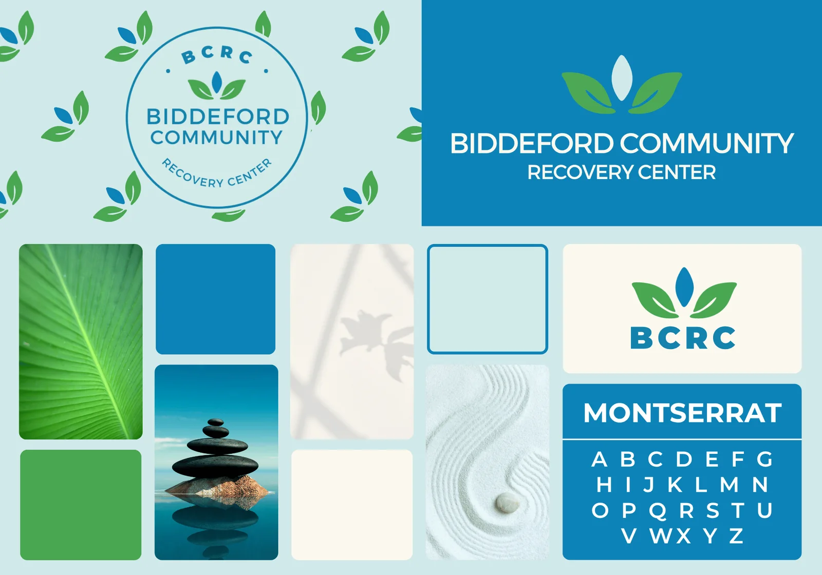
A calm, hopeful identity for a place people come to start fresh.
A recovery center has to feel safe before anyone walks through the door. A steady blue and fresh green surround a mark with a seed at its center, planted as a symbol of the new start BCRC helps people make. Friendly Montserrat type keeps it from ever feeling clinical or intimidating, and quiet imagery like stacked stones and raked sand keeps the whole brand grounded.
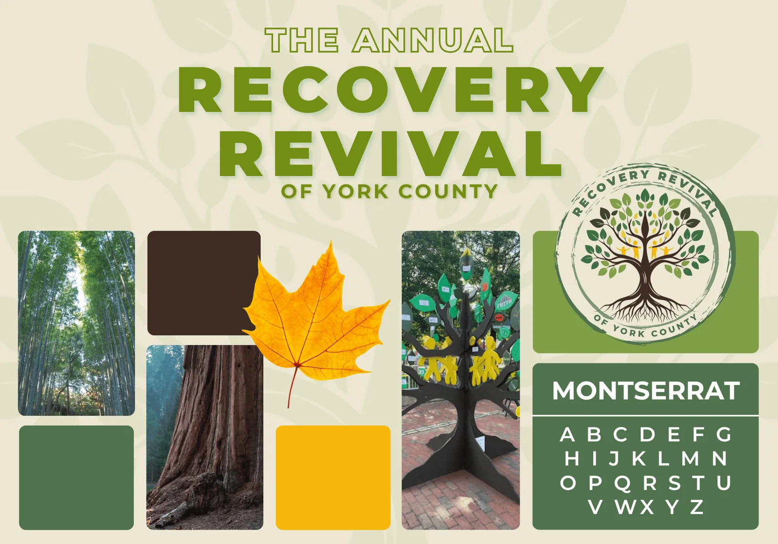
The seed planted in BCRC's logo, grown into a tree for its annual event.
The tree carries two ideas: the revival of the seasons, and the seed we planted in the BCRC mark. The foundation BCRC is building grows into the community surrounding recovery, gathered together in its branches. Forest greens tie it back to the parent brand, while autumn gold and earthy brown give it the warmth of a celebration. Bold Montserrat headlines read easily on banners, shirts, and signage.
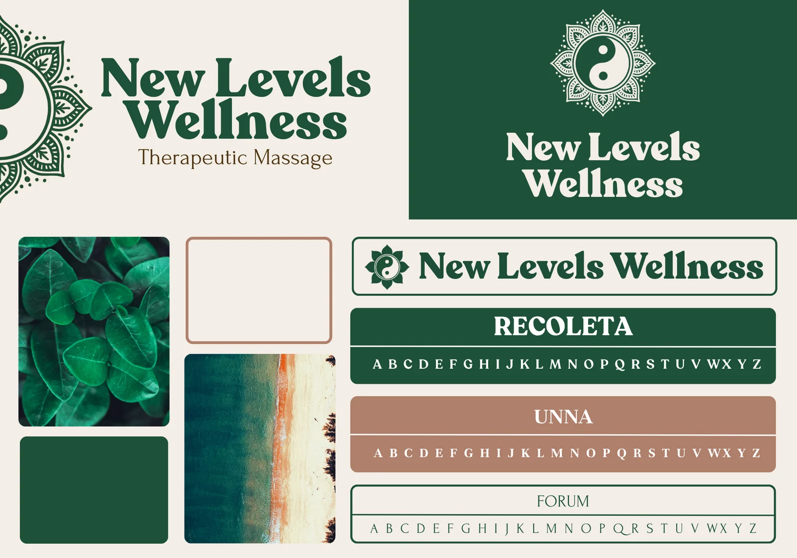
A woodland apothecary feel, with type that keeps it approachable.
Deep forest green, warm cream, and a soft clay accent give the practice a woodland apothecary vibe, with a mandala yin-yang mark that speaks to balance. Recoleta's soft, rounded serifs keep it friendly and approachable, a natural match for her clinical, results-focused style. The brand carries through her website, booking experience, and everything clients see.
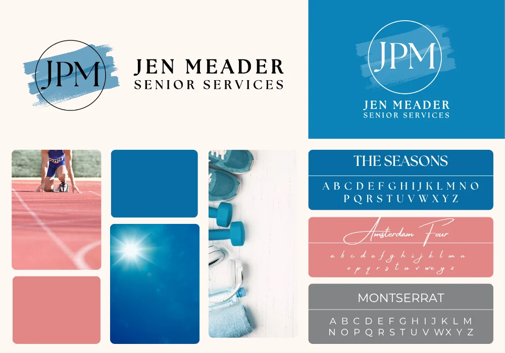
As warm and welcoming as the work itself.
Jen Meader helps older adults move better, stay stronger, and keep their independence, so her brand has to be easy for her clients to read. We designed her logo around legibility: a clean JPM monogram in a fine-line circle, with her name set in spaced serif capitals that read clearly at any size, on a business card or across the room. Ocean blue and dusty rose keep it calm and inviting, with a brushstroke of energy that matches the work she does.
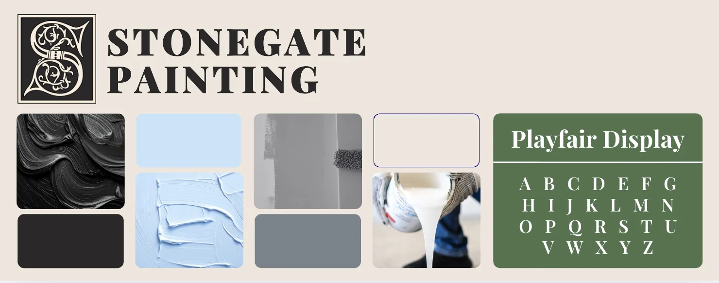
Old-world craftsmanship, in a brand as refined as the finish.
Stonegate's work is premium, so the brand needed to feel that way too. An ornate illuminated-letter S monogram and a classic Playfair Display serif give it a heritage feel, while charcoal, sky blue, slate, and sage read like a curated paint deck. It tells homeowners this is a painter who cares about the details before they see a single brushstroke.
A logo is where a brand starts, not where it ends. Every brand package gives you a complete, consistent toolkit you can use everywhere.
A primary logo, alternate layouts, and a simple icon, so you always have the right version for the space.
A set of brand colors chosen for your market, with the exact values for print, web, and signage.
Typefaces that fit your personality, paired for headlines and everyday text so everything reads as one brand.
The look and feel of the photos and graphics that go with your brand, so new content always fits.
See your brand on business cards, vehicles, signage, and more before anything goes to print.
A simple guide showing how it all fits together, so anyone working on your brand gets it right.
A clear process with no surprises. You always know what's happening next and what we need from you.
A free 30-minute conversation about your business, your customers, and what you want people to feel when they see your name.
We research your market and competitors, then present design directions built around what makes you different.
You pick a direction and we refine it together, from the logo to the colors, type, and supporting pieces.
You get your full brand kit, with files ready for print, web, and social, plus your brand guide.
Yes. Sometimes a business has real recognition worth keeping, and a refresh is the right move. We'll talk through what's working and recommend the right approach.
Your logos in the formats you'll need for print, web, and social, along with your colors, fonts, and a brand guide that shows how to use them.
Yes. Building the brand and the website together is the smoothest path, since the site is designed around your new identity from day one.
Free 30-minute consultation. No pressure, no jargon.
Just a straight conversation about what your business needs.